How to make your brand look professional on a small budget
You don't need an agency or a big photoshoot. Five changes do most of the work, and you can make them this week.
 Maya ChenDesign lead6 min read
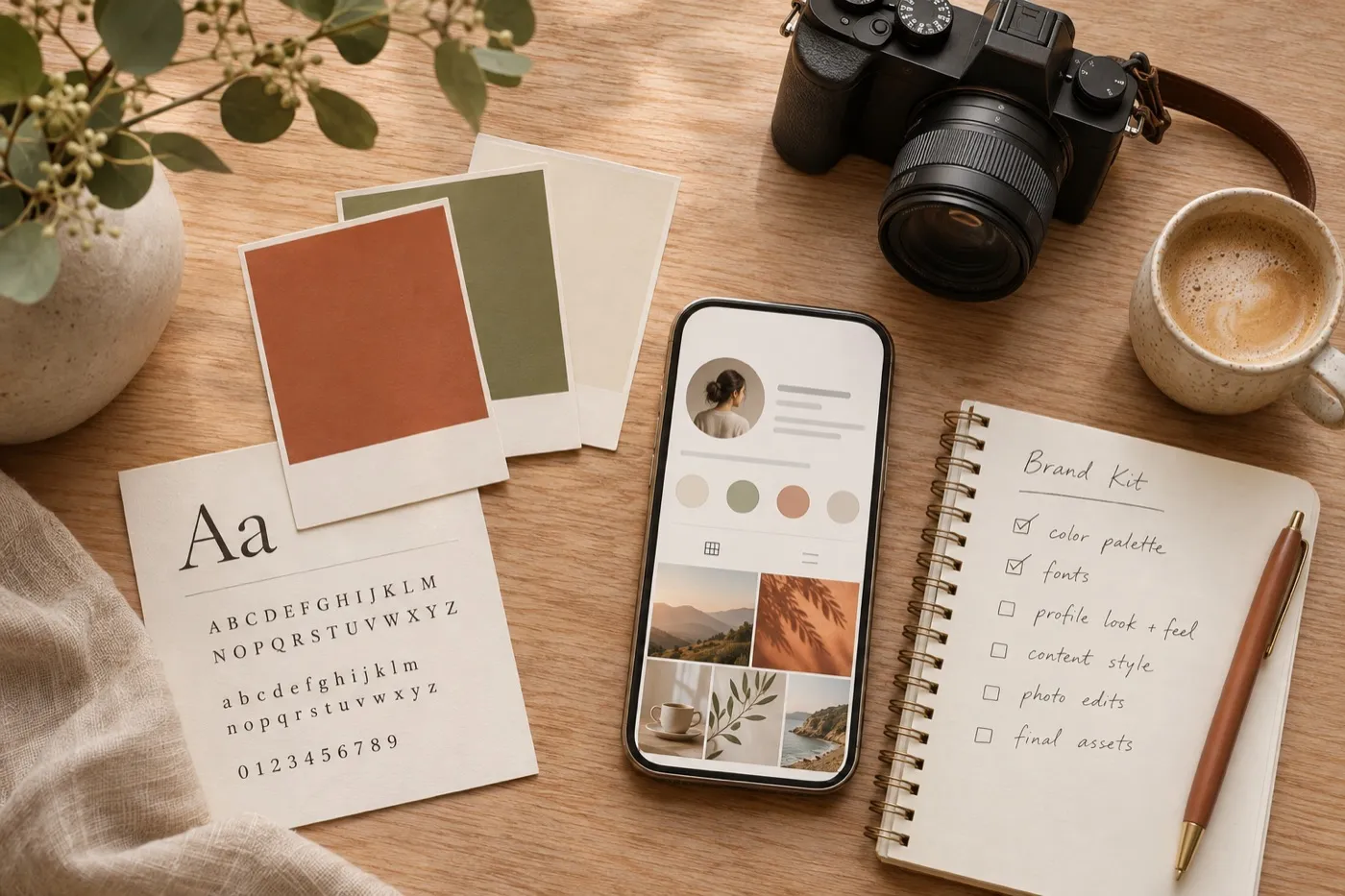
People decide in a few seconds whether you look like someone worth following. They glance at your profile photo, your banner, your last few posts and your bio, and they make up their mind.
The good news is that looking professional has very little to do with budget. It comes from a handful of clear choices, made once and used everywhere. Here are the five that make the biggest difference, in the order we’d make them.
1. Start with one clear look
Most creator brands look messy for one simple reason: every post is designed from scratch. Fix that by choosing a few rules and sticking to them.
- Two fonts. One bold font for headlines, one simple font for everything else.
- Three colors. One main color, one accent, and one neutral like off white or charcoal.
- One photo style. Bright and natural, dark and moody, or clean on a plain background. Pick one and keep it.
Write these down in a note on your phone. That note is your brand kit, and it costs nothing.
My brand kitNotes
- Fonts
- Headline BoldBody text, simple and clear
- Colors
- Photos
- Bright, natural light, warm kitchen
2. Fix the places people see first
Before anyone watches, listens or reads, they see three things: your profile photo, your banner or header, and your name. Make them feel like they belong together.
- Use a clear, well lit photo of your face, or a simple mark if you’re a brand. Check that it still works as a tiny circle.
- Make your banner say what you do in a few words, using your fonts and colors.
- Keep your name and handle the same on every platform, if you can.

If someone sees your profile for one second, they should know what you make and who it’s for.
3. Make a small set of templates
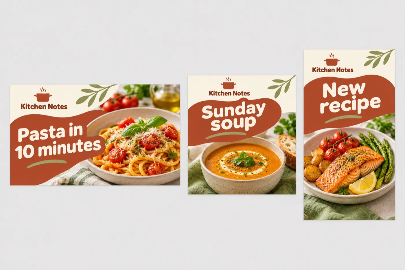
Templates are how small creators look like big ones. Make three, and reuse them for months.
- A cover or thumbnail template with space for a face or image and a few big words.
- A post template for tips, quotes and announcements.
- A story template for behind the scenes moments and reminders.
Change the words and the photo each time, but keep the layout, fonts and colors. After a few weeks, people will recognize your posts before they see your name.
4. Write a bio that says what you do
Your bio has one job: help the right people decide to follow you. Skip the inside jokes and the long list of titles. A simple formula works almost everywhere: what you make, who it’s for, and what to do next.
Example
Weeknight recipes for busy people. New video every Sunday. Grab the free shopping list below.
Then make the link in your bio count. Point it to one clear place, not ten.
5. Show up the same way everywhere
Consistency matters more than any single great post. Use the same photo, colors and voice on every platform where you’re active, and post on a schedule you can keep.
It’s better to post twice a week for a year than every day for a month. A simple content calendar makes this much easier.
What you can skip for now
- A perfect logo. Your name in a good font is enough for a long time.
- An expensive photoshoot. A phone, a window and a plain wall go a long way.
- Being on every platform. Do one or two well before adding more.
- Constant redesigns. Changing your look every month undoes the recognition you’re building.
A quick checklist
Save this and work through it one line at a time.
- Two fonts, three colors, one photo style
- A profile photo that works as a tiny circle
- A banner that says what you do
- Three templates you reuse
- A bio with what, who and what next
- One clear link in your bio
- A posting schedule you can keep
None of this needs a big budget. It needs a few clear decisions, made once. Start with your profile today, and the rest gets easier every week.

Written by
Maya Chen, Design lead at Viewmize
Maya helps creators build brands people recognize at a glance. She has designed covers, channel art and press kits for independent musicians, podcasters and YouTubers.
Ask Maya's team a question