How to make single cover art: from the song to a store-ready file
Turn your song into a single cover that looks pro, reads as a tiny square and passes review, plus every file you need for release day.
A single cover has one job: make a stranger scrolling past stop for half a second.
It doesn’t need to win awards. It needs to look like your genre, read at the size of a fingernail, and feel like the song.
Most guides stop at the specs. This one walks you from the song to the finished file, and every version of it you’ll need on release day.
The short answer
Pull one feeling and one image out of the song. Shoot or make the art yourself, or license it, so you own it. Build it at least 3000 x 3000 pixels, in sRGB, and 4000 x 4000 if your art allows.
Add only your name and title in one bold font, or no text. Test it next to covers in your genre. Then export the store file and every promo size from that one master.
What you’ll learn
- A simple way to turn a song into a cover idea
- Which way to make it, with what artists really pay
- How to shoot your own cover photo, even on a phone
- How to set up, type and test the file
- How to keep every single in an era looking like yours
- Every file you need on release day
What makes a single cover work?
One clear idea that still reads as a tiny square, fits your genre, and feels like the song. That’s it. Most people first see your cover as a small square in a playlist or in search, next to dozens of others.
Art directors behind covers for Kanye West and Kendrick Lamar told Spotify for Artists they check covers on their phones, and that one strong image is often enough. And one widely upvoted musician on Reddit summed up the stakes: great covers earn clicks, bad ones cost them, and the ones in the middle barely register.
So aim for clear and confident, not complicated.
How do you turn a song into a cover idea?
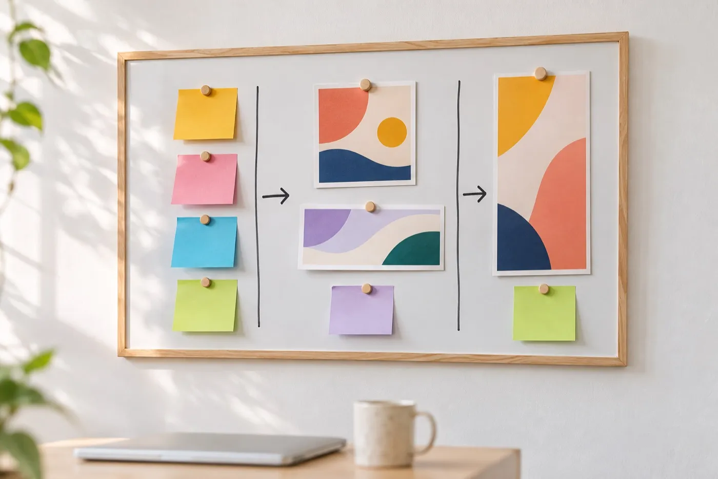
Pull one feeling, one line, one object and one color out of the song. Then try them as four different covers.
- Write down four things. The feeling the song leaves you with. One lyric that sums it up. One object that shows up in it, or could. One color it sounds like.
- Sketch four routes. Spend two minutes on each, as tiny squares. Rough is fine.
- Go sideways, not literal. A song about leaving home doesn’t need a suitcase. When one artist asked Reddit for cover ideas for an album called “Gravity”, the top answer was a flat grid with one dent in it.
- Check your genre. Open this week’s new releases in your genre and screenshot the covers you’d tap. Yours should look like it belongs there, and still stand out.
Face
A person and a feeling
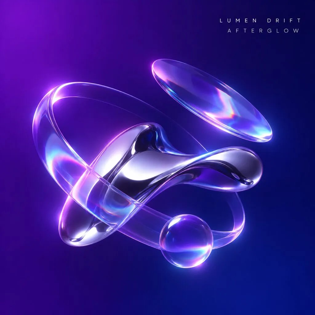
Object
One thing that stands for the song
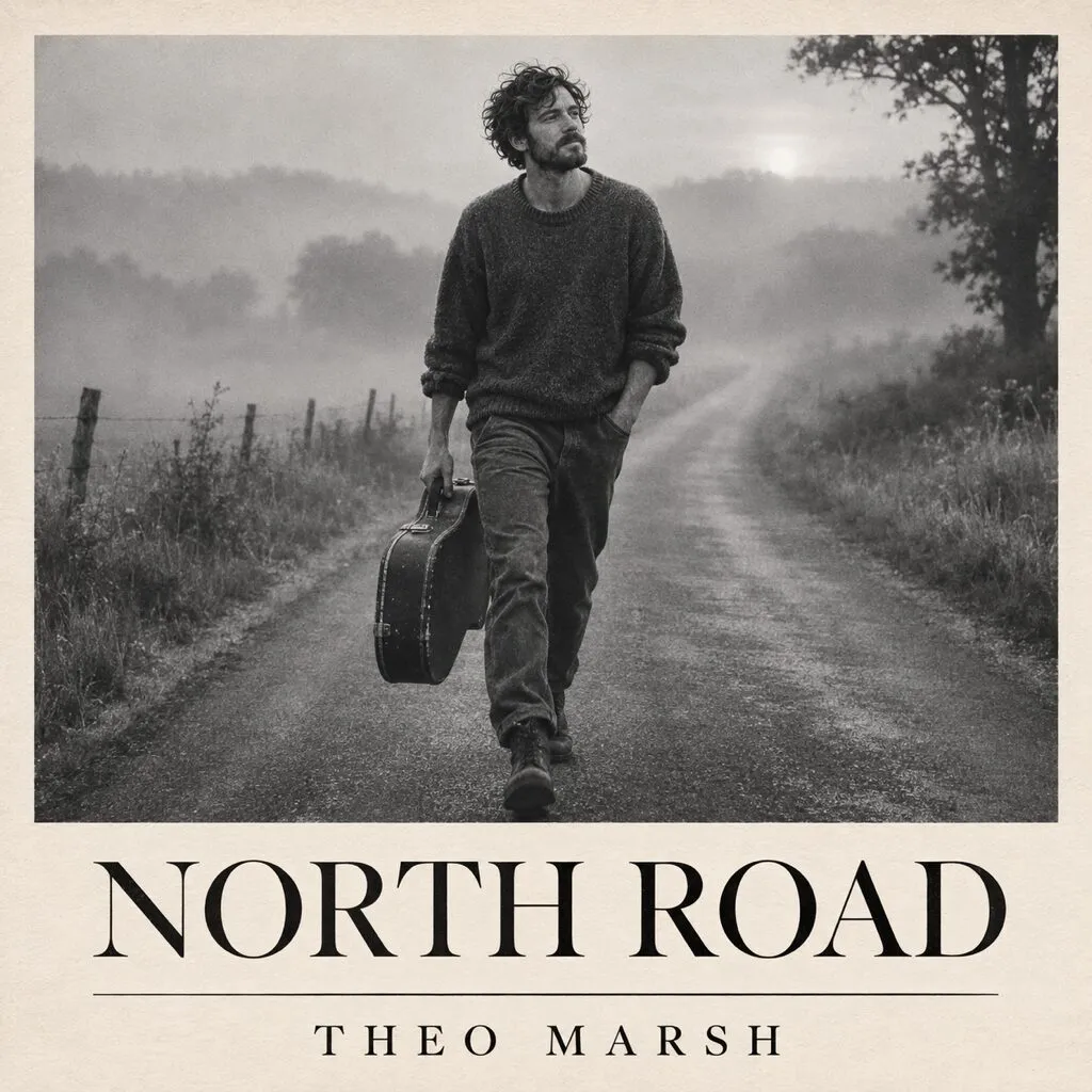
Place
Where the song lives
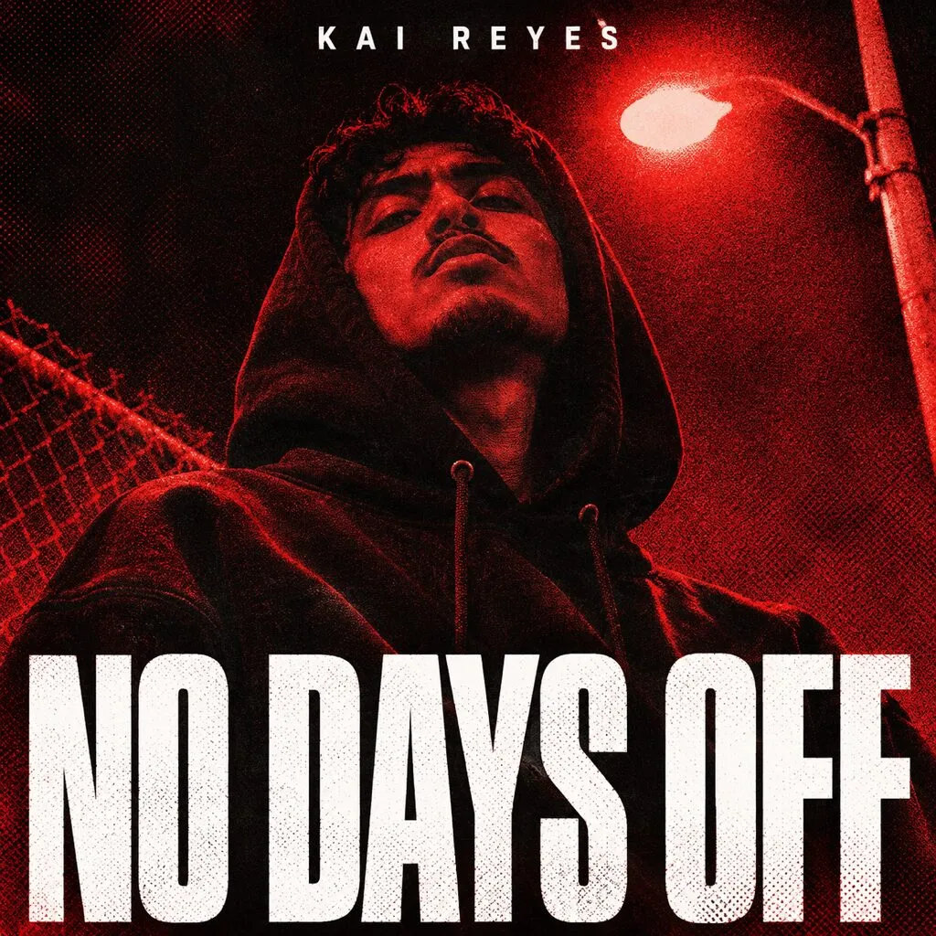
Type
The title is the image
An old design rule helps you choose: if you have to explain the cover, it isn’t working. Pick the sketch that makes sense at a glance.
Which way should you make your cover?
Your own photo is the best free route. Pay when the single matters most. A lead single you’ll push with ads deserves more than a quick drop between bigger releases.
| Route | What artists report paying | Watch out for |
|---|---|---|
| Your own photo, edited | Free, plus a few hours | Looks amateur without a crop, a color grade and good type |
| A friend or a photographer | A tip for a friend, around $1,000 for a pro | The photographer owns the photo. Get permission in writing |
| License an artist’s existing piece | $50 to $150 from emerging artists, $1,000+ from established ones | Get commercial use in writing |
| A template app | Free, or a monthly fee | Other artists use the same templates, and Apple rejects generic art that isn’t specific to your release |
| A marketplace designer | From about $15 | Some resell stolen or AI art. Check their past work |
| A freelance designer | Around $150 to $500 a cover | The good ones book up, so ask early |
| An AI image | A tool subscription | Listener backlash, little or no copyright, and you may be asked to disclose it |
Prices are what musicians report paying in Reddit threads, not quotes. Licensing an artist’s existing piece is the most underrated route on the list: several artists say painters and illustrators happily license art they’ve already made, and they’re likely to share the release too.
How do you shoot your own cover photo?
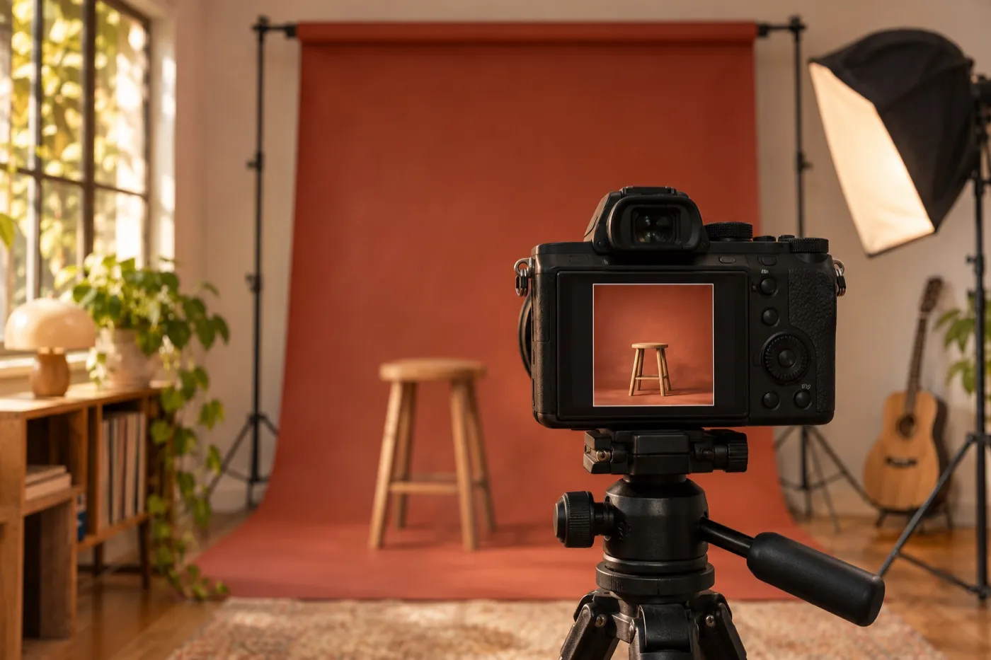
A phone is enough. Light, background and framing matter more than the camera.
- Shoot at full resolution. Use your phone’s highest quality mode, like a 48 MP setting if it has one. A square crop from a standard 12 MP photo tops out around 3000 pixels, so there’s no room left to crop tighter.
- Use soft light. A big window, an overcast day or the hour before sunset. Skip the flash.
- Keep the background plain. A wall, a bedsheet, a paper backdrop or the sky.
- Frame for a square. Keep the subject near the center, with room where the title will go.
- Shoot vertical too. The same setup gives you your Canvas and story versions.
- Shoot a series. Change the outfit, angle or color between frames. One shoot can cover your next three singles.
- Edit lightly. Crop tight, set the darkest and brightest points, and add one color grade. That’s most of what critique threads ask for.
If someone else takes the photo, they own it, even if it’s a photo of you. That’s how the US Copyright Office explains photo rights. Get their permission in writing. Separately, if other people are recognizable in the shot, get their OK too. That falls under privacy and publicity rules, not copyright.
How do you set up the file?
Build a square master as big as your art allows: at least 3000 x 3000 pixels, ideally 4000 x 4000, in sRGB. Keep it layered. Make the art at full size from the start. Never stretch a smaller image up.
Why aim for 4000? Apple’s artist help page asks for at least 4000 x 4000. Some distributors cap uploads at 3000, so you’ll export a smaller copy for them. Our guide to the cover spec every store accepts has each distributor’s limits.
| Tool | Start a new file | Watch out for |
|---|---|---|
| Photoshop | A square in pixels, RGB color | Export with Convert to sRGB turned on |
| Photopea | Free in your browser | Export with File, then Export As |
| Canva | Custom size, set in px | Its library elements can’t be part of a logo, and templates repeat |
| Procreate | Custom Canvas, set in pixels | It defaults to Display P3. Pick an sRGB profile when you start |
The Procreate handbook on creating a canvas shows where to pick the profile. The short version for any tool: start in sRGB, and the colors you approve are the colors people see.
What text should go on a single cover?
Your artist name and the single’s title, or nothing at all. If you add text, make it bold, readable and part of the picture.
- Spell both exactly like your release info. Same capitals, same symbols. Distributors reject mismatches.
- One font, two weights at most. Thin and script fonts vanish at small sizes.
- Make it belong. Take the text color from the image, and keep it as sharp as the photo. Text that looks pasted on is a common note in critique threads.
- Read it like a stranger. One musician titled a release “8/18” and almost everyone read it as “8118”.
- Use a font you’re allowed to use. Google Fonts are free for commercial use, including covers. A font labeled “free for personal use” isn’t licensed for a release.
No text is a real option, too. A strong image with no words often reads better as a tiny square, as long as it still feels like your music. One catch: CD Baby may reject generic art, like a plain color square, and recommends adding your name and title. A real image with no words is fine.
How do you make your singles look like one era?
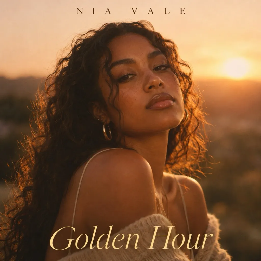
Lock three things for the whole era, and change one or two on every release.
- Lock: the font and where it sits, two or three colors, and the photo style or a repeating motif.
- Change: the photo or subject, the main color, or the crop.
- Always make a new cover. Stores can reject one identical to an earlier release. And a single’s cover can show the single’s title or no title, never the album’s.
Golden Hour
Single 1
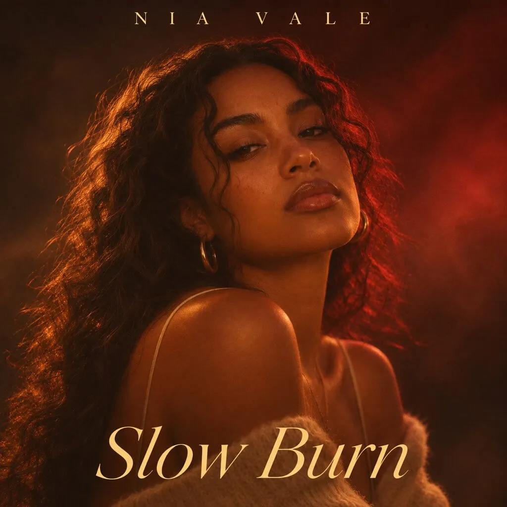
Slow Burn
Single 2
Kept
- Name spaced across the top
- Serif title at the bottom
- Same pose and framing
Changed
- Light: sunset to smoke
- Color: gold to deep red
- The title
Spotify’s advice on building a visual identity makes the same point: a cohesive look across platforms has the biggest impact, and your imagery should evolve with your sound. It’s the idea behind a simple brand kit for creators, applied to your music.
One musician’s warning is worth keeping in mind: only set a level you can keep up. If single four looks rushed next to single one, people notice.
Should you use AI to make your single cover?
You can, but for most artists it costs more than it saves.
- You may not own it. The US Copyright Office’s report on AI says purely AI-made images aren’t protected by copyright, and that prompts alone don’t make you the author.
- You may be asked. DistroKid’s artwork rules now include a question at upload about whether AI made your cover.
- Listeners notice. In an r/edmproduction thread on AI covers with about 1,200 upvotes, many producers said they skip AI covers and assume the music is AI too. Kesha even replaced an AI cover after fans pushed back.
If you use it anyway, use it for ideas and mood boards, not the final image. And set the type yourself, so it matches your release info exactly.
How do you test your cover before release?
Test it the way listeners will see it: small, in a crowd, for a few seconds.
- The playlist test. Drop your cover into a screenshot of a playlist in your genre. Does it stand out? Does it still look like your genre?
- The grayscale test. Turn it black and white. If the title or the subject fades, add contrast.
- The three second test. Show it to a friend for three seconds. Ask what the mood is and what the title says.
Then run the checklist critique threads keep coming back to: a tight crop, a color grade, no blown out highlights, text blended in, every element equally sharp, and one clear focal point. If the release is explicit, give the Parental Advisory label room so it doesn’t look tacked on.
What files do you need on release day?
One master, and an export for every place your cover goes. Make them all at once, so nothing gets rushed the night before.
Master
4000 x 4000
Store cover
3000 x 3000
Canvas
576 x 1024
Story
1080 x 1920
Feed post
1080 x 1350
Video
1920 x 1080
| File | Size | Where it goes |
|---|---|---|
| Store cover | 3000 x 3000 JPG, or 4000 if allowed | Your distributor |
| Spotify Canvas | Exact 9:16, 720 to 1080 px tall, 3 to 8 sec | Spotify for Artists |
| Story | 1080 x 1920 | Instagram and TikTok stories |
| Feed post | 1080 x 1350 | Instagram feed |
| Video | 1920 x 1080 or bigger | A lyric video or visualizer |
| No text | Same as the master | Visualizers, merch and backgrounds |
The Spotify Canvas guidelines suggest connecting the loop to your cover, so animate the no-text version if you’re short on time. Spotify’s Canvas content policy bans URLs and asking for follows.
How do you brief a designer?
Send everything they need in one message, so the first draft is close.
- A link to the song, even a rough mix
- Your artist name and title, spelled exactly like your release
- Your release date, with final files due a week before you upload, since you’ll want to upload at least four weeks before release, with a future release date set
- Three to five words for the mood
- Three covers you love, and what you like about each
- Anything to avoid
- The files you need, from the table above
- Who owns the final files, in writing
And protect yourself. One artist on Reddit paid a designer, then got blocked a month later with no cover. Commenters found the designer’s portfolio included another band’s album art with filters on top. Look closely at past work, run a sample through a reverse image search, and pay with buyer protection.
Why is the eighth cover harder than the first?
Because by then, the hard part isn’t design. It’s keeping up.
A single every six weeks is eight or nine covers a year. Each one has to look new, look like you, pass review, and come with its promo versions, all while you’re finishing the next song. That’s where a lot of DIY runs fall apart, and where the “they’ve fallen off” comments start.
That’s why we keep each artist’s look on file and build every new cover from it, so single eight looks as sharp as single one. It’s how our cover requests work, and you can see the results in our single and album cover examples.
What should you check before you call it done?
- One clear idea that makes sense at a glance
- You own or licensed every photo, illustration and font
- A square master, at least 3000 x 3000 pixels, in sRGB
- Name and title spelled exactly like your release info, or no text
- Readable as a tiny square, and in black and white
- Looks like your genre in a playlist screenshot
- Same font, layout and colors as the rest of the era
- A new cover, not a copy of an earlier one
- Store cover, Canvas, story, feed and video files exported
- Uploaded four weeks early, with a future release date set
Single cover art questions musicians ask
Can I make single cover art on my phone?
Yes. Shoot in soft light, edit with your phone's photo editor or a free app, and add text in a design app that lets you set a custom size. Shoot at full resolution, so the photo is big enough for a 3000 x 3000 crop without stretching.
Can I use a picture I found on Google?
No. Someone owns almost every image online, and using one without a license can get your release rejected or pulled. Use your own photo, art you licensed, or work made for you.
How much does single cover art cost?
It can be free if you shoot and edit it yourself. Musicians report paying from about $15 on marketplaces to $150 to $500 for a freelance designer, and more for well known illustrators or photographers.
Do I need my name on my single cover?
No. Plenty of covers use no text at all. If you do add your name or title, spell them exactly like your release info, because distributors reject covers that don't match.
Does cover art actually affect streams?
Nobody has published clean before and after data. Many musicians think a great cover earns extra clicks and a bad one costs them, while an average one barely matters. The safest bet is a cover that is clear, fits your genre and looks like you.

Written by
Maya Chen, Design lead at Viewmize
Maya helps creators build brands people recognize at a glance. She has designed covers, channel art and press kits for independent musicians, podcasters and YouTubers.
Ask Maya's team a question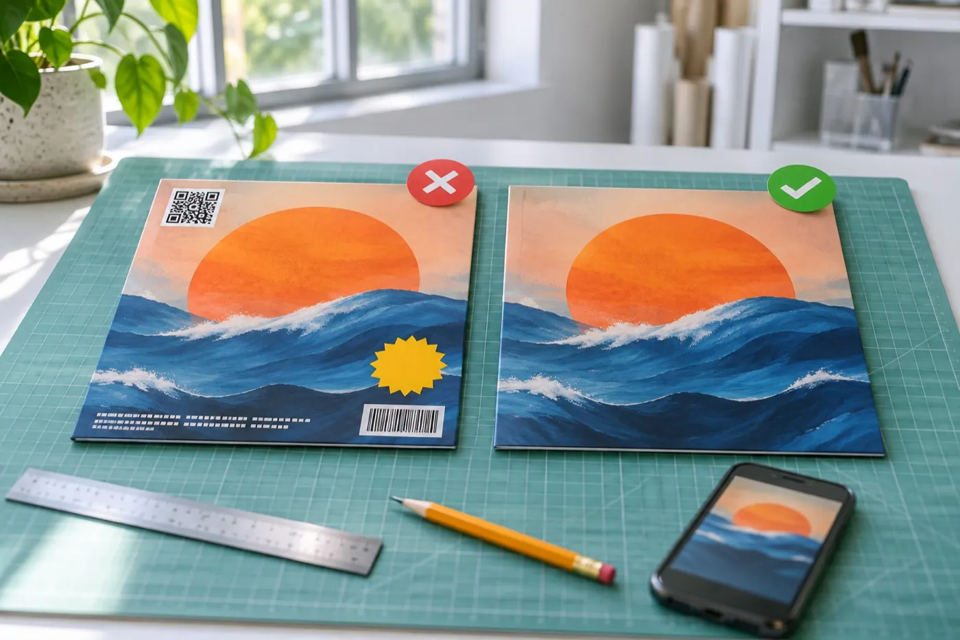
 Maya Chen ·