Spotify cover art requirements: the one spec that passes every store
Spotify accepts covers as small as 640 pixels. Your distributor may not. Here's the one spec that clears every store, and what gets covers rejected.
Spotify will take a cover as small as 640 pixels. Most distributors won’t.
That gap is where a lot of rejected releases start. You never upload straight to Spotify. Your cover goes to your distributor, and your distributor sends it to Spotify, Apple Music, Amazon, YouTube Music and the rest.
So your cover doesn’t just need to pass Spotify. It needs to pass the strictest rule in that whole chain.
The short answer
Export your cover as a 3000 x 3000 pixel JPG, in sRGB, under 10 MB. Put nothing on it but your artist name and title, spelled exactly like your release info. Or put no text on it at all.
That spec clears Spotify, Apple Music and every distributor in this guide.
What you’ll learn
- What Spotify actually asks for, and why it isn’t enough
- The size, format and file limits for Apple Music and 7 distributors, side by side
- How to export a cover that won’t get flagged for quality
- The rules behind most rejections, and how to handle text on your cover
- What to do if a cover gets rejected, or needs to change after release
What are Spotify’s cover art requirements?
Spotify wants a square image between 640 and 10,000 pixels wide, saved as a JPG, PNG or TIFF in the sRGB color space. That’s the whole list. Spotify’s official cover art requirements say nothing about what the image can show.
| Spotify asks for | What it means for you |
|---|---|
| A square image (1:1) | Same width and height, to the pixel |
| 640 to 10,000 pixels | Use the biggest original you have, within that range |
| JPG, PNG or TIFF | Not every distributor takes PNG or TIFF (see the table below) |
| sRGB, 24 bits per pixel | Standard screen color, 8 bits per channel. Not CMYK, not a wide color space like P3 |
| No upscaling | Don’t stretch a small image to hit a size. It looks soft and gets flagged |
| No embedded profile or rotation data | Convert to sRGB before you export instead of relying on a profile |
Why Spotify’s minimum is a trap
Your distributor sends one file to every store, so every store’s rules apply to it. Apple Music won’t take anything under 1,400 pixels. TuneCore wants 1,600. UnitedMasters wants 3,000.
A 640 pixel cover that Spotify would happily show never makes it to Spotify. It gets stopped one step earlier.
Smallest cover each one accepts
Spotify
640
DistroKid
1,000
Apple Music
1,400
TuneCore
1,600
UnitedMasters
3,000
Your file
3,000
3000 x 3000 clears every one
What size should album cover art be?
3000 x 3000 pixels. It’s the only size that fits every distributor below: TuneCore and CD Baby won’t take anything bigger, and UnitedMasters won’t take anything smaller. Singles, EPs and albums all use the same spec. Sizes are in pixels, per side of the square.
| Platform | Min | Max | Formats |
|---|---|---|---|
| Spotify | 640 | 10,000 | JPG, PNG, TIFF |
| Apple Music | 1,400 | Not given | JPG, PNG |
| DistroKid | 1,000 | Not given | JPG |
| TuneCore | 1,600 | 3,000 | JPG, PNG, GIF |
| CD Baby | 1,400 | 3,000 | JPG, PNG, GIF |
| UnitedMasters | 3,000 | 6,000 | JPG, PNG |
| Amuse | 1,400 | 6,000 | JPG, PNG |
| Ditto | 1,400 | Not given | JPG only |
File size limits are lower than most people expect: 10 MB at TuneCore and Ditto, 25 MB at CD Baby and 150 MB at UnitedMasters. The others don’t publish one.
Every number here comes from the platform’s own help page. Distributors update these pages, so check yours before you upload. Its page has the final say.
One catch on Apple’s side: its delivery spec, the one distributors follow, sets the 1,400 minimum above and recommends 3000 or bigger. Its artist help page asks for at least 4000 x 4000. Distributors deliver to the first, so 3000 x 3000 passes. If yours takes bigger files, like DistroKid or Amuse, a 4000 x 4000 upload covers both.
How should you export your cover?
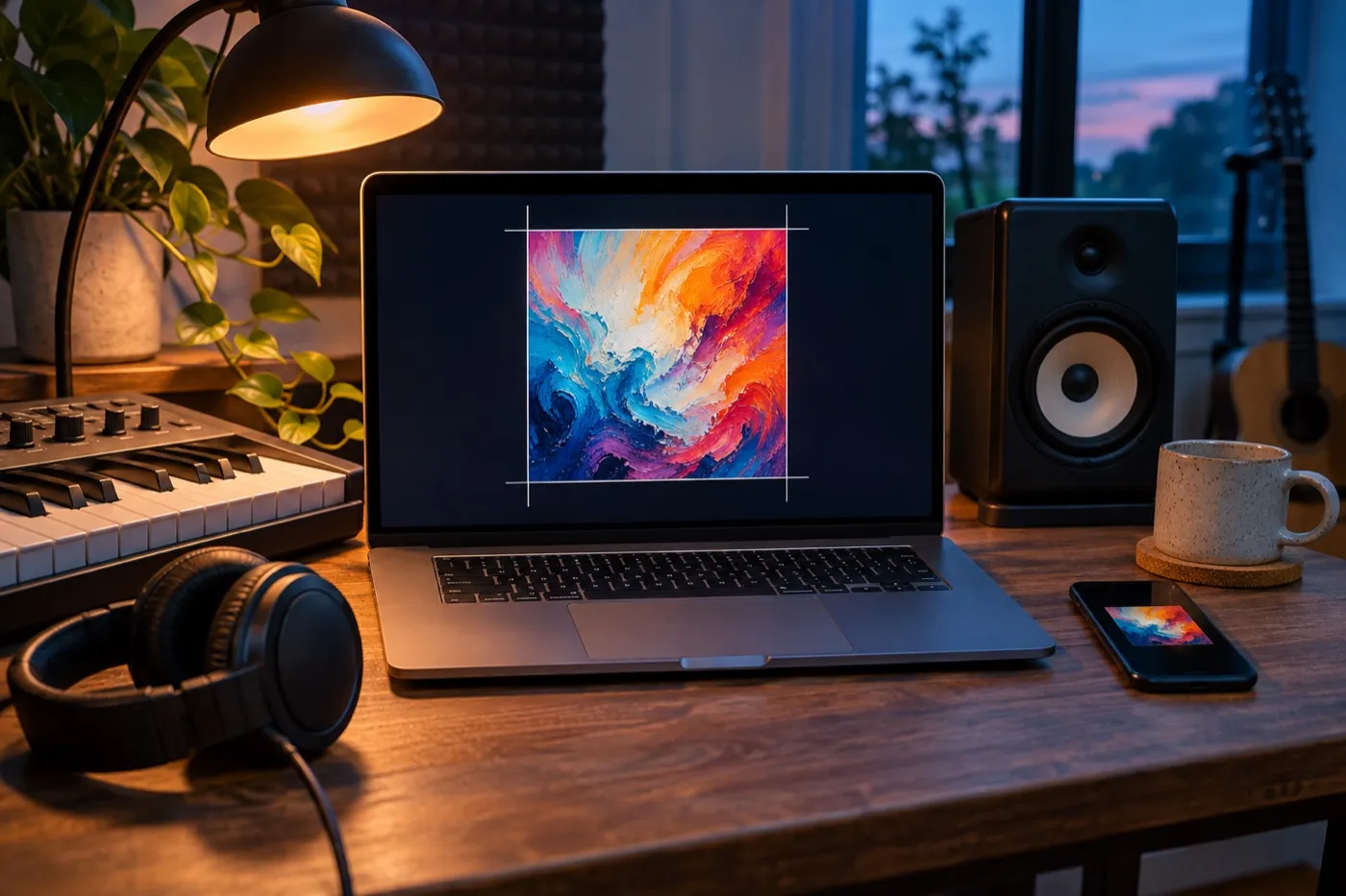
Make it at 3000 x 3000 or bigger, then export once as a high quality JPG in sRGB. Never scale a small image up.
- Start big. If your photo or artwork is smaller than 3,000 pixels, find a bigger original. A 1,400 pixel image stretched to 3,000 looks soft, and “blurry” and “pixelated” are on almost every rejection list.
- Convert to sRGB. Print files are often CMYK, and some design apps work in a wide color space called Display P3. Convert to sRGB before you export, so the colors you approve are the colors people see.
- Export as a JPG. In Photoshop, use Export As, pick JPG, tick Convert to sRGB and untick Embed Color Profile.
- Check the file size. Keep it under 10 MB so it fits TuneCore and Ditto. If it’s over, lower the JPG quality a little. Don’t shrink the pixel size.
- Don’t stress about DPI. Screens only count pixels, so a 3000 x 3000 file looks the same at 72 or 300 DPI. Some upload forms check for at least 72, so leave it there or higher.
What gets cover art rejected?
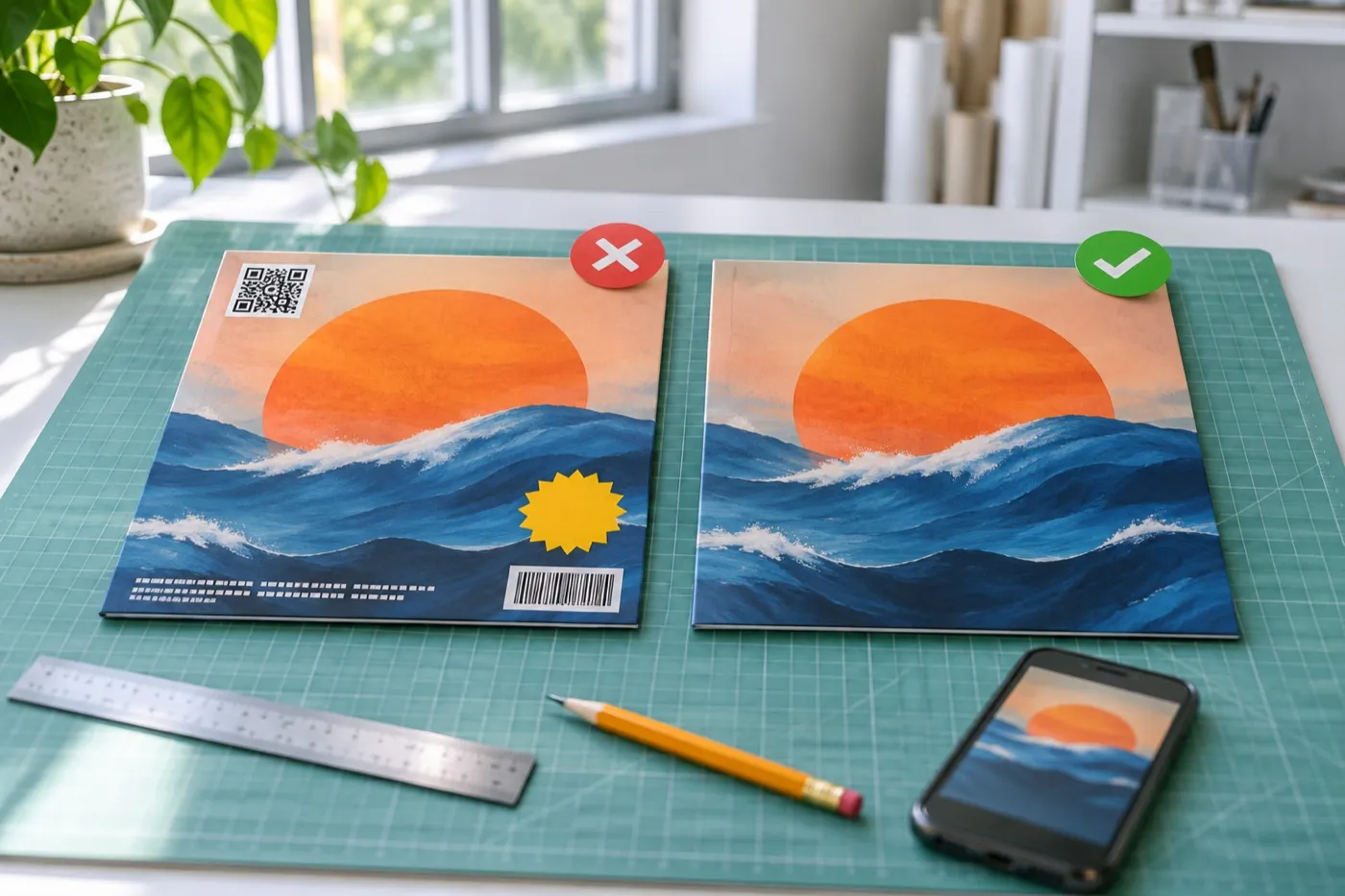
Most rejections come from what’s on the cover, not its size. Spotify publishes no content rules, but Apple Music and every distributor do, and your one upload has to pass all of them.
The Apple Music Style Guide and the distributors’ help pages agree on most of it:
| What gets flagged | What it looks like |
|---|---|
| Links and contact info | A website, social handle, email, phone number or QR code |
| Promo words and dates | “New”, “Out now”, “Exclusive”, a release date or a price |
| Logos and codes | Spotify, Apple or social media logos, other brands’ logos, a barcode |
| Physical formats | The words “CD” or “vinyl”, or a scan of a CD |
| Audio format claims | “Dolby Atmos”, “lossless” or “24-bit” |
| Low quality | Blurry, pixelated, rotated or cut off, or art shrunk into a corner |
| Images you don’t own | Unlicensed photos, a celebrity’s photo, someone else’s artwork |
| Generic art | A plain color square, a simple gradient or an obvious template |
| Explicit images | Nudity or gore |
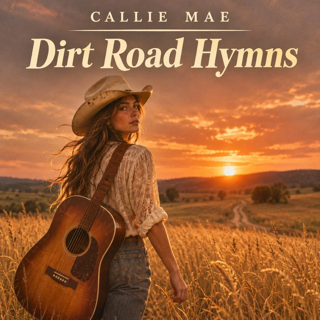 OUT NOW@calliemaeCDcalliemae.com
Gets flagged
Passes
None of this stops you from promoting the release. Make two versions: a clean store version that follows these rules, and a promo version for socials, where “Out now” and your handle belong.
Two rules trip up more artists than all the others: the text on the cover, and reusing the same art.
Can you put your name and song title on the cover?
Yes, but only your artist name and release title, and they have to match your release info exactly. TuneCore, CD Baby, Amuse and Ditto all say so. If you can’t match it exactly, leave the text off.
“Exactly” is strict:
- Same spelling, capitals and symbols as your artist and title fields. A shortened version of your artist name counts as a mismatch. Artists on Reddit report rejections for exactly that.
- Featured artists on the cover need to match the release info too.
- Watch for text you didn’t add. A street sign, a shirt slogan or a shop name in your photo is still text on your cover.
- Label logos are a gray area. Amuse allows a label name, Apple bans logos in general, and others ban label logos outright. Leaving it off is the safe call.
Can singles and the album use the same cover art?
Not the same image. CD Baby says no two releases can use the exact same cover, and DistroKid says duplicate art may be rejected.
What works is one look for the whole era, with a new version for each release. Keep the fonts, the photo style and the layout. Change the color, the crop, the photo or the title. It’s the same idea as a simple brand kit for creators: a few choices you make once and reuse on everything.
Do the math on a real release schedule. A single every six weeks is eight or nine covers a year. Each one has to be different, pass every rule, and still look like it belongs to you. That’s why we keep each artist’s look on file and build every new cover from it. It’s how our design requests work, and it’s what keeps a rollout looking like one story.
Can you use AI art or stock photos on your cover?
Yes to both, with conditions. AI art is allowed, but it can’t mislead anyone. Stock photos need a license that covers a commercial release.
- AI art: DistroKid lets you tell it when AI made your artwork as you upload. Apple bans using AI in a misleading way, so an AI image of a person who isn’t on the record is a bad idea.
- Stock photos: an unlicensed image is a rejection and a legal problem. DistroKid lists stock photography among its rejection reasons, so check your distributor’s rules before you build a cover around one.
- Fonts: a font that’s free for personal use isn’t licensed for a commercial release. Check the license.
Rules aside, plenty of listeners read an obviously AI cover as a sign the music took little effort too. If you want a release taken seriously, the cover is the first thing that says so.
What happens if your cover art gets rejected?
Your distributor emails you the reason. Fix that exact thing, then replace just the artwork in your dashboard. Don’t upload the whole release again.
- DistroKid includes the details in the rejection email. Use its Replace Artwork option, and reply to the email if you think the rejection was a mistake. Our DistroKid artwork guide covers every error and rejection, and the fix for each.
- CD Baby moves your release to the end of the inspection queue if you edit it during inspection.
- Amuse and UnitedMasters let you fix the art and resubmit from your account.
Every rejection costs days, and you want time left to pitch. You can only pitch a song to Spotify’s editors once your distributor has delivered it, and if you pitch at least 7 days before release, Spotify adds it to your followers’ Release Radar. Upload about four weeks early, with a future release date set, so a rejection doesn’t cost you that. On some distributors, like DistroKid, picking a future date is a paid feature.
Can you change your cover art after release?
Usually, but not on Spotify itself, and it’s slow. You ask your distributor, it sends the update to every store, and the stores catch up at their own pace.
| Distributor | Changing the cover after release |
|---|---|
| DistroKid | Send an edit request. It can take 1 to 3 weeks to show everywhere |
| UnitedMasters | Allowed, with up to 2 updates per release, each approved by its team |
| Amuse | Change it in the app after approval |
| CD Baby | Locked. You’d have to cancel and submit a new release |
Once your distributor sends the update, Spotify needs at least 2 business days to process it. Some stores keep showing the old cover until they catch up. Treat your cover as final the moment you upload it.
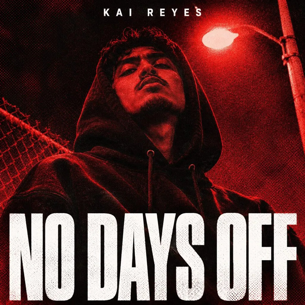
How do you make a cover that still works as a tiny square?
Shrink it to thumbnail size on your phone and look at it. If you can’t tell what it is, or can’t read the title, simplify it.
Passing review is the floor. Most people first see your cover as a small square in a playlist or in search results, next to dozens of others. It has a split second to make them press play.
- One focal point. A face, an object or one bold shape. Busy collages turn to mush when they’re small.
- Big, heavy type, or none. Thin and script fonts disappear first.
- Strong contrast. Turn the cover black and white. If the title fades into the background, it will on a phone too.
- Check it in context. Drop it into a screenshot of a playlist in your genre. Does it stand out, or blend in?
the quiet hours of a long september evening
the quiet hours of a long september evening
The Quiet Hours
Your artist name
Lost at playlist size
No Days Off
Kai Reyes
Still reads as a tiny square
This is the part no upload checker catches. A cover can follow every rule and still vanish in a playlist. Our guide on how to make single cover art walks through the whole process, from the song to the file. Every one of our album and single cover examples is made to work full size and as a tiny square on a phone.
What should you check before you upload?
Run through this list before you hit submit. It takes two minutes and can save you a week.
- Square, exactly 3000 x 3000 pixels
- JPG, in sRGB, under 10 MB
- Made at full size, never stretched up from a smaller image
- Only your artist name and title, spelled like your release info, or no text
- No links, handles, QR codes, logos, barcodes, prices or dates
- No "new", "out now", "CD" or "vinyl" anywhere
- Every photo, illustration and font licensed for a commercial release
- A different image from all your other releases
- AI use disclosed, if your distributor asks
- Still clear as a tiny square on your phone
Cover art questions musicians ask
Can I use a PNG instead of a JPG?
Spotify, Apple Music, TuneCore and CD Baby all take PNG, but DistroKid asks for a JPG and Ditto only takes JPG. A JPG works everywhere, so it is the safe choice.
Does cover art need to be 300 DPI?
No. Stores only look at the pixel size, so a 3000 x 3000 file is the same at 72 or 300 DPI. Some upload forms ask for at least 72 DPI, so set it to 72 or higher.
Why does my cover look washed out on Spotify?
Usually the file was made in CMYK for print or in a wide color space like Display P3, and the colors shifted when it was converted. Convert to sRGB yourself before you export, so you approve the colors people actually see.
Can I put a Parental Advisory label on my cover?
Only if the release is marked as explicit. Amuse and Ditto both say the label cannot go on a clean release.
Can I put my record label's logo on the cover?
It depends on your distributor. Amuse allows a label name, while Apple bans logos in general and some distributors ban label logos outright. Leaving it off is the safe call.

Written by
Maya Chen, Design lead at Viewmize
Maya helps creators build brands people recognize at a glance. She has designed covers, channel art and press kits for independent musicians, podcasters and YouTubers.
Ask Maya's team a question
 Maya Chen ·