Instagram carousel design: a slide-by-slide guide to posts people save
The structure, sizes and type rules for carousels people swipe through, save and send, and how to make one design work on Instagram and TikTok.
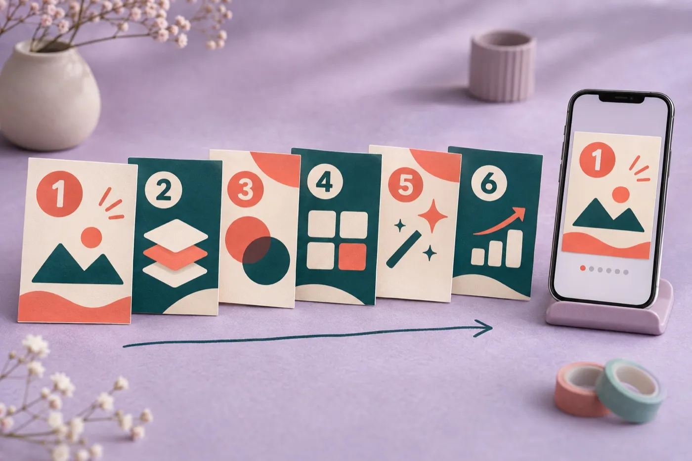
Instagram gives carousels a second chance that no other post gets.
If someone scrolls past your carousel without swiping, Instagram will often show it to them again, starting on slide 2. So every carousel really has two covers. Most people only design one.
That’s the kind of detail this guide is about. Not “use templates and bright colors,” but how each slide earns the next swipe, the sizes and type that hold up on a phone, and how to make a carousel people want to save and send.
The short answer
Design at 1080 x 1350 or 1080 x 1440. Give every slide one job: a hook, a second cover, one idea per slide, one slide worth sending on its own, and a clear ask at the end. Keep the text big, the look consistent and the slide count as short as the idea allows.
What you’ll learn
- The right size for each slide, and how the profile grid crops your cover
- A slide-by-slide structure that keeps people swiping
- How many slides to use, and how much text fits on each
- How to keep every carousel looking like yours
- How to reuse a carousel on TikTok, and export it without losing quality
What size should an Instagram carousel be?
Use 1080 x 1350 (4:5) for a safe choice, or 1080 x 1440 (3:4) to fill the most screen. Instagram accepts shapes from wide 1.91:1 up to tall 3:4, and a carousel can hold up to 20 photos and videos.
| Shape | Size | Use it when |
|---|---|---|
| 3:4 | 1080 x 1440 | You post from the app and want the tallest slides |
| 4:5 | 1080 x 1350 | You use a scheduling tool, or want one safe default |
| 1:1 | 1080 x 1080 | Your content is square by nature, like a product |
| TikTok 9:16 | 1080 x 1920 | You’re posting the same carousel as TikTok photos |
Two rules catch people out:
- One shape for every slide. The shape you pick applies to the whole carousel. Design all the slides at the same size.
- Some scheduling tools can’t post 3:4 yet. Meta’s publishing tools for apps still top out at 4:5, and some schedulers cap carousels at 10 slides. Check yours before you design at 3:4.
How the profile grid crops your cover
Instagram’s profile grid now shows posts as tall rectangles instead of squares. A 3:4 cover shows in full. A 4:5 cover loses a thin strip on each side, so keep text and faces away from the left and right edges of your first slide.
4:5 cover
1/7
5 habits of creators who keep growing.
Swipe
Sides trimmed
3:4 cover
1/7
5 habits of creators who keep growing.
Swipe
Shows in full
How do you structure a carousel slide by slide?
Give every slide one job, and make each one earn the next swipe. Here’s the structure that works for most educational carousels.
- The hook. One promise, in big type, in 10 words or fewer. A strong statement usually beats a question: “You’re pricing your services too low” stops more people than “Are you pricing right?”
- The second cover. This is the slide Instagram may open on for people who skipped the first time. Make it work alone: restate the payoff and deliver the first useful thing right away.
- One idea per slide. Each middle slide makes one point, then leaves a small question the next slide answers.
- A slide worth sending. Put the most useful part, like a checklist, a framework or a before and after, on one slide that makes sense on its own. That’s the slide people screenshot and forward.
- The ask. End with one specific action. “Send this to a friend who’s job hunting” works better than “follow for more.”
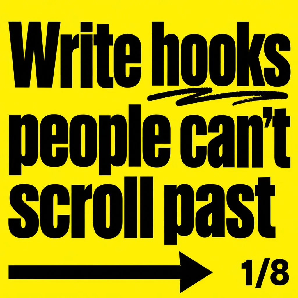
Hook
1/8

Second cover
2/8

One idea
3/8

One idea
4/8
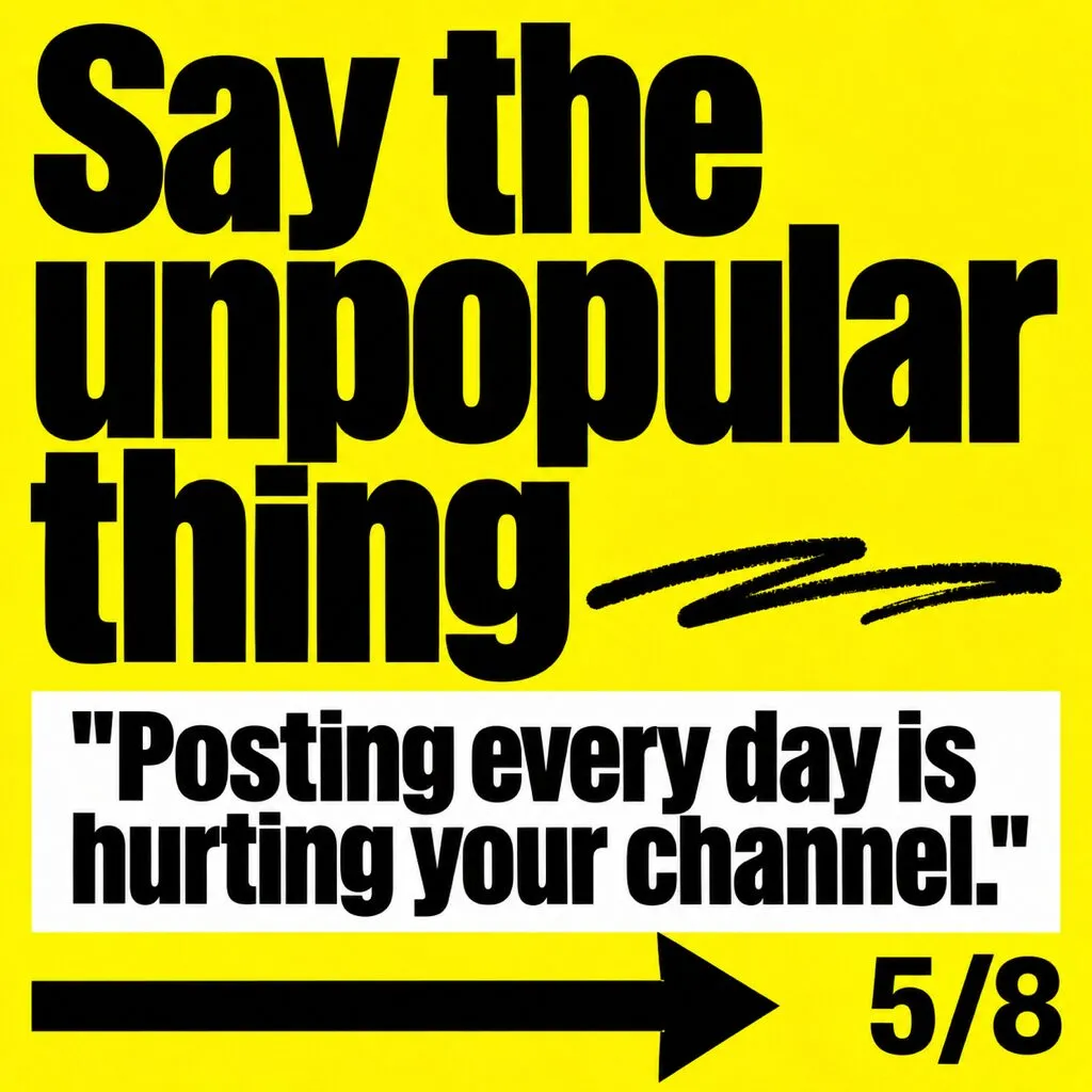
One idea
5/8
One idea
6/8

One idea
7/8

The ask
8/8
Why sending matters: Instagram’s own explanation of feed ranking predicts how likely you are to swipe through the whole carousel, and how likely you are to share a post in a message. It names informative posts, like tutorials and how-tos, as the kind people share.
How many slides should a carousel have?
As many as the idea needs, and not one more. For most educational carousels that’s 6 to 10 slides, even though Instagram allows 20.
Instagram’s ranking looks at how many slides your carousel has and whether people swipe all the way through. A padded slide doesn’t just bore people. It gives them a reason to stop swiping.
A simple test: draft the carousel, then delete any slide that doesn’t change what the reader knows or does. If the story still works, the slide wasn’t pulling its weight.
How much text fits on a slide?
One idea per slide, in about 20 words or fewer, set big enough to read on a phone. The detail goes in the caption.
Here’s the math most guides skip. A phone shows your 1080 pixel wide slide at about 400 points wide, roughly a third of its size. So:
| Text on the slide | Size at 1080 px wide | How it shows on a phone |
|---|---|---|
| Headline | 80 px or more | About 30 points, easy to read |
| Body text | 40 to 50 px | About 15 to 20 points |
| Small notes | Avoid going under 32 | Hard to read without zooming |
Treat 40 pixels as the floor for anything people need to read. Then a few more rules keep slides easy on the eyes:
- Strong contrast. Dark text on a light background, or the reverse. No text over a busy photo without a solid shape behind it.
- Same position every time. Put the headline in the same spot on every slide, so the eye knows where to look.
- Margins. Keep text at least 60 pixels from the edges, and further on the cover.
- Write a real caption. Instagram says captions tell search engines what your content is about, so the caption is where the keywords and the full explanation go.
How do you keep every carousel looking like yours?
Build a small system instead of reusing one template. Most carousels only need five slide types: a cover, a setup slide, a point slide, a proof slide and an ask. Design each one once, with fixed fonts, colors and margins, and every new carousel becomes a matter of filling them in.
Your followers should recognize your cover before they read your name. That’s the same idea as a simple brand kit for creators: a few decisions made once and used everywhere.
What about seamless carousels, where one wide image flows across the slides? They’re great for visual stories, like a timeline or a panorama. For teaching, they usually hurt: text that crosses a slide edge gets cut in half, and the cover still has to make sense on its own in the grid.
This is where carousels eat time. With a solid template, creators report 30 to 60 minutes per carousel. Without one, it can take hours, and at that pace most people stop posting. It’s also why we design carousels slide by slide, written and laid out to earn the first swipe. You can swipe through a few in our carousel examples.
Can you post the same carousel on TikTok?
Yes, but resize it first. TikTok photo posts can hold up to 35 photos and show them one after another with music. They’re full-screen vertical, so a 4:5 slide needs to become 9:16.
1/7
5 habits of creators who keep growing.
Swipe
Instagram 4:5
1/7
5 habits of creators who keep growing.
TikTok 9:16
- Covered by the caption and buttons
- Move text up and in. TikTok puts your caption along the bottom and its buttons down the right side. Keep the important text in the upper middle.
- Upload clean files. Export each slide fresh for each app. Don’t upload a download that carries another app’s watermark.
- Rewrite the hook. The first slide is doing a different job in a full-screen feed. Test a bolder version.
How do you export a carousel without losing quality?
Export at the size you’ll post, and let Instagram upload it at full quality. Blurry slides are one of the most common carousel complaints, and most of the fixes are simple.
- Export at 1080 pixels wide, or at most twice that. Huge files get compressed harder.
- Use PNG for slides that are mostly text and flat color. Use JPG for photos.
- Turn on high quality uploads in Instagram’s settings, under media quality.
- Test on a private account if you’re unsure how a slide will look after upload.
- Add alt text. In the app, tap More options before you share, then Write alt text, and describe what the carousel teaches.
What should you check before you post a carousel?
Run through this before you hit share.
- Every slide the same size: 1080 x 1350 or 1080 x 1440
- A hook on slide 1, in 10 words or fewer
- A slide 2 that works as a second cover
- One idea per slide, about 20 words or fewer
- Body text at least 40 pixels, headlines 80 or more
- Nothing important near the left and right edges of the cover
- One slide worth sending on its own
- One specific ask on the last slide
- A caption with the full explanation and the words people search for
- Alt text added, and a 9:16 version ready for TikTok
Carousel questions creators ask
How many slides can an Instagram carousel have?
Up to 20 photos and videos when you post from the app. Some scheduling tools still cap carousels at 10, so check yours before you plan a long one.
Why does my carousel start on the second slide?
That's Instagram giving it a second chance. If someone scrolled past without swiping, Instagram may show the carousel again starting on slide 2. That's why slide 2 should work as a second cover.
Do carousels get more reach than Reels?
Usually not. In large studies from scheduling tools, Reels tend to reach more people, while carousels tend to get more engagement from the people they reach. Many creators use Reels to be discovered and carousels to be saved and shared.
Can you add music to an Instagram carousel?
Yes, you can add music to photo carousels. Instagram says carousels with audio may also appear in the Reels tab, which can bring in new viewers.
Can you edit a carousel after posting it?
You can change the order of the slides and edit the caption, but you cannot add new slides. Fix typos before you post.

Written by
Maya Chen, Design lead at Viewmize
Maya helps creators build brands people recognize at a glance. She has designed covers, channel art and press kits for independent musicians, podcasters and YouTubers.
Ask Maya's team a question
 Maya Chen ·