YouTube thumbnail best practices: the checklist to run before you upload
Most thumbnail advice has no data behind it. This checklist does: what YouTube recommends, what holds up in studies, and what to check before you publish.
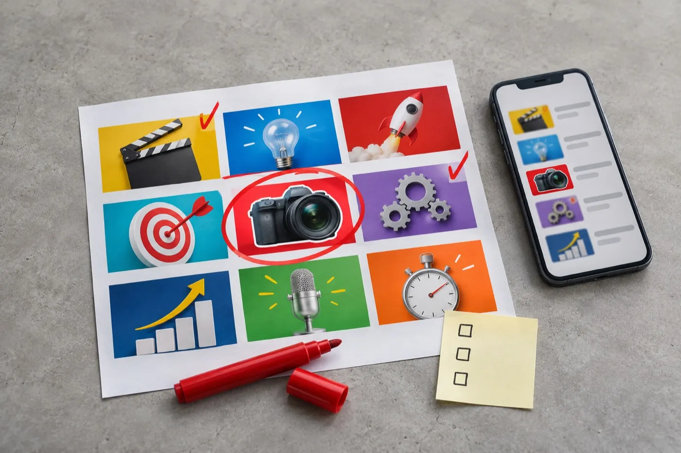
In one study of nearly 3,000 YouTube thumbnails, faces showed up on 84% of breakout videos, and on 82% of the videos that flopped.
That’s the problem with most thumbnail advice. It comes from looking at winners only. Show your face, use bright colors, add big text: the flops do all of that too.
So this guide sticks to three sources: what YouTube itself recommends, what holds up when you compare hits with flops, and what creators learn from testing their own thumbnails.
The short answer
A good thumbnail makes one clear promise that the title doesn’t repeat and the video keeps. One subject, big enough to read on a phone and a TV. A few words at most. Nothing important hidden under YouTube’s overlays. Then you test it.
What you’ll learn
- What YouTube itself recommends, and the current size rules
- Which popular thumbnail “rules” hold up in the data, and which don’t
- How to pair your thumbnail and title so they make one promise
- How to design for a phone and a TV at the same time
- How to test and refresh thumbnails, plus a checklist for every upload
What does YouTube itself recommend for thumbnails?
Keep it simple, readable and as large as possible. YouTube’s own thumbnail tips come down to a short list:
- Show actions and emotions if your videos target casual viewers.
- Use the rule of thirds to place your subject.
- Pick an easy-to-read font if you add text.
- Don’t overload it. Color and composition catch the eye, but too much overwhelms it.
- Fill the frame. Thumbnails show up differently across devices, so make the image as large as possible.
YouTube also splits the job in two: familiar visuals for your subscribers, so they spot your videos, and clear actions or emotions for new viewers, who don’t know you yet.
The current size rules
Most guides still quote 1280 x 720. That’s out of date. Here’s what YouTube’s thumbnail help page says now:
| Thumbnail | Size and shape |
|---|---|
| Videos | 3840 x 2160 recommended, 16:9, at least 640 pixels wide |
| Shorts | 2160 x 3840 recommended, 9:16, added in Studio on a computer |
| Podcasts | Square, 1:1 |
| File type | JPG or PNG |
| File size | Up to 2 MB from your phone, up to 50 MB from a computer |
| Custom uploads | Your account has to be verified with a phone number first |
Podcast thumbnails follow different rules, which we cover in our podcast cover art guide.
Which thumbnail rules actually hold up?
Fewer than you’d think. When researchers and analytics companies compare thumbnails of hits with thumbnails of flops, most popular rules turn out to be the baseline, not the thing that makes a thumbnail win.
| The rule | What the evidence says | What to do |
|---|---|---|
| Show your face | In Eden’s study of breakouts vs flops, faces appeared on 84% of hits and 82% of flops, a gap small enough to be noise. Another large analysis found faces and no faces perform about the same overall, with big swings by niche | Use a face when it shows a real reaction, or when people come for you. Then test |
| Use bright colors | In the same study, brightness and contrast were no different between hits and flops | Treat contrast as the minimum, not the edge |
| Add text | Flops were a little more likely to have no text at all. In vidIQ’s look at 500 breakouts, those with text used about five words | A few words that add to the title |
| Show emotion | Netflix found complex emotions beat stoic faces in its artwork tests | A real reaction to the video’s moment, not a stock shocked face |
| Keep it simple | Netflix also found images with more than three people were less likely to win | One subject, three or four elements at most |
Two caveats. These are mostly studies run by companies that sell YouTube tools, and they show patterns, not cause and effect. That’s exactly why testing your own thumbnails beats any rule, including the ones in this guide.
Real channels show the same thing. One creator added their face to their thumbnails because a video said it would raise clicks, and their click-through rate fell from 5% to 0.9%. Another switched to “more professional” thumbnails with a big text block over their photos, and their click-through rate fell from 8% to 6%. Commenters pointed out that the competing videos showed the full photo.
How do you make your thumbnail and title work together?
Make them one promise, told two ways. The title says what the video is. The thumbnail shows why you should care. If they say the same thing word for word, you’ve wasted half your space.
Repeats the title
I tried budget phones
I tried budget phones
Tech on a Budget · 48K views
Adds to the title
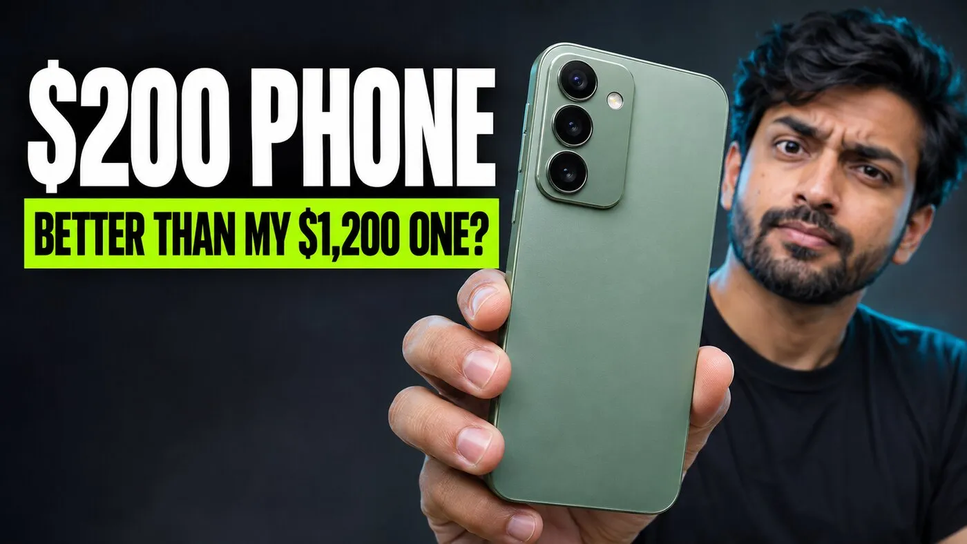
I tried budget phones
Tech on a Budget · 48K views
Then make sure the video delivers it. YouTube puts this bluntly: if your thumbnail gets a high click-through rate but a low average view duration, it’s clickbait, and clickbait videos are less likely to get recommended.
There’s a hard line too. YouTube’s thumbnail policy doesn’t allow thumbnails that make viewers think they’ll see something that isn’t in the video. Break it, and the thumbnail can be removed and your channel can get a strike.
How do you design a thumbnail for a phone and a TV?
Build it around one idea that reads at every size. The same thumbnail shows up as a small rectangle in a phone feed and, on YouTube’s TV app, supersized, front and center. In the US, TV has passed mobile as the top screen for YouTube watch time, so this isn’t an edge case anymore.
TV
Computer
Phone
- One hero. One face, one object or one moment, filling most of the frame. A subject that’s too small is one of the most common problems in thumbnail critiques.
- Three or four elements at most. Every extra thing makes the rest smaller.
- A few big words, in a bold font. Use a thick outline or a solid shape behind the text so it never blends into the photo.
- Shoot for the thumbnail. A frame grabbed from your video rarely beats a photo taken for the thumbnail.
- Do the shrink test. Look at it at half the width of your phone screen. If you can’t tell what it is in a second, simplify.
What covers part of your thumbnail?
YouTube draws on top of your thumbnail, so keep key details away from the edges. The video length sits in the bottom-right corner. A progress bar runs along the bottom when someone has already started watching. Both cover whatever you put there.
 12:34
- Covered by YouTube
- 12:34Video length
- Progress bar
Text hidden under the time badge comes up again and again in thumbnail critiques. It’s an easy fix, as long as you check for it before you publish.
Does your thumbnail stand out in your niche?
Search your own topic and look at your thumbnail in the results. You’re not competing with the whole of YouTube. You’re competing with the 10 or 20 videos next to yours.
- Learn your niche’s conventions, then break one. Gaming viewers ignore default game art. Cooking viewers want the dish looking its best. Tech viewers click a close-up of the product as readily as a face.
- Borrow the principle, not the look. Copying a big creator’s open-mouth face makes you blend in. Borrow the contrast and the single clear idea instead.
- Keep one repeated element. A color, a font or a frame that ties your videos together helps subscribers spot you, the same way a simple brand kit does. A rigid template that hides your best image does the opposite.
This is where a designer earns their keep: knowing what your niche already looks like, and making your video look like the obvious click without looking like everyone else. Every one of our YouTube thumbnail examples is built to stand out in a crowded feed and keep a channel looking consistent.
How do you test and refresh thumbnails?
Test with YouTube’s own tool, then go back to your older videos.
YouTube’s Test & Compare runs up to three thumbnails on the same video and picks the one that earns the most watch time. Two details most people miss: upload all three at 720p or higher, or every option gets shrunk to 480p, and YouTube suggests testing on older videos first. We explain why watch time decides the winner in our guide to what thumbnails cost and when to pay for them.
Then refresh your back catalog:
- Pick videos with lots of impressions and a weak click-through rate. Videos nobody is shown won’t gain much from a new thumbnail.
- Change one thing at a time, so you know what worked.
- Don’t panic over one dip. Click-through rate naturally falls when YouTube shows a video to new audiences, so compare like with like.
YouTube is building more of this in. At Made on YouTube it announced dynamic thumbnails, which show the best of three options to different parts of your audience, plus tools that suggest refreshed thumbnails for older videos. Either way, you need strong options to choose from.
What should you check before you publish a thumbnail?
Run through this every time. It takes two minutes.
- One clear promise that the title does not repeat
- The video delivers what the thumbnail shows
- One hero subject, filling most of the frame
- Three or four elements at most
- A few big words, readable at half your phone width
- Nothing important in the bottom-right corner or along the bottom edge
- Stands out next to the videos around it in search
- One element that ties it to your channel
- 3840 x 2160, JPG or PNG, under 2 MB if you upload from your phone
- Two or three versions ready for Test & Compare on the videos that matter
Thumbnail questions creators ask
How many words should a YouTube thumbnail have?
As few as you can. Breakout thumbnails with text use about five words, and many great ones use one to three. The words should add to the title, not repeat it, and stay readable at half your phone width.
Should I put my face on my thumbnail?
Only when it helps the promise. Faces are about as common on thumbnails that flop as on ones that take off. A face works best when it shows a real reaction to the video, or when viewers already come for you. Test it on a few videos first.
Can YouTube Shorts have custom thumbnails?
Yes, for a growing number of creators. YouTube started with Partner Program creators and is expanding. You add them in YouTube Studio on a computer, at 2160 x 3840 in a 9:16 shape.
Why can't I upload a custom thumbnail?
Your account has to be verified with a phone number first. YouTube can also take away custom thumbnails for 30 days after repeated policy violations.
Will changing a thumbnail hurt my video?
No. YouTube encourages refreshing thumbnails on older videos. Just compare results carefully, because where your views come from can change at the same time. Test & Compare does that comparison for you.

Written by
Maya Chen, Design lead at Viewmize
Maya helps creators build brands people recognize at a glance. She has designed covers, channel art and press kits for independent musicians, podcasters and YouTubers.
Ask Maya's team a question
 Maya Chen ·